The research community has stepped up in a number of ways during this pandemic. Many organizations are providing not just data but visualization or dashboard tools to help understand what is happening in near real-time.
Reliable data is critical amid the COVID-19 pandemic. Below is a collection of resources that can help with tracking cases, preparing for surge capacity, understanding the spread at a community level, and more.
Tracking the cases
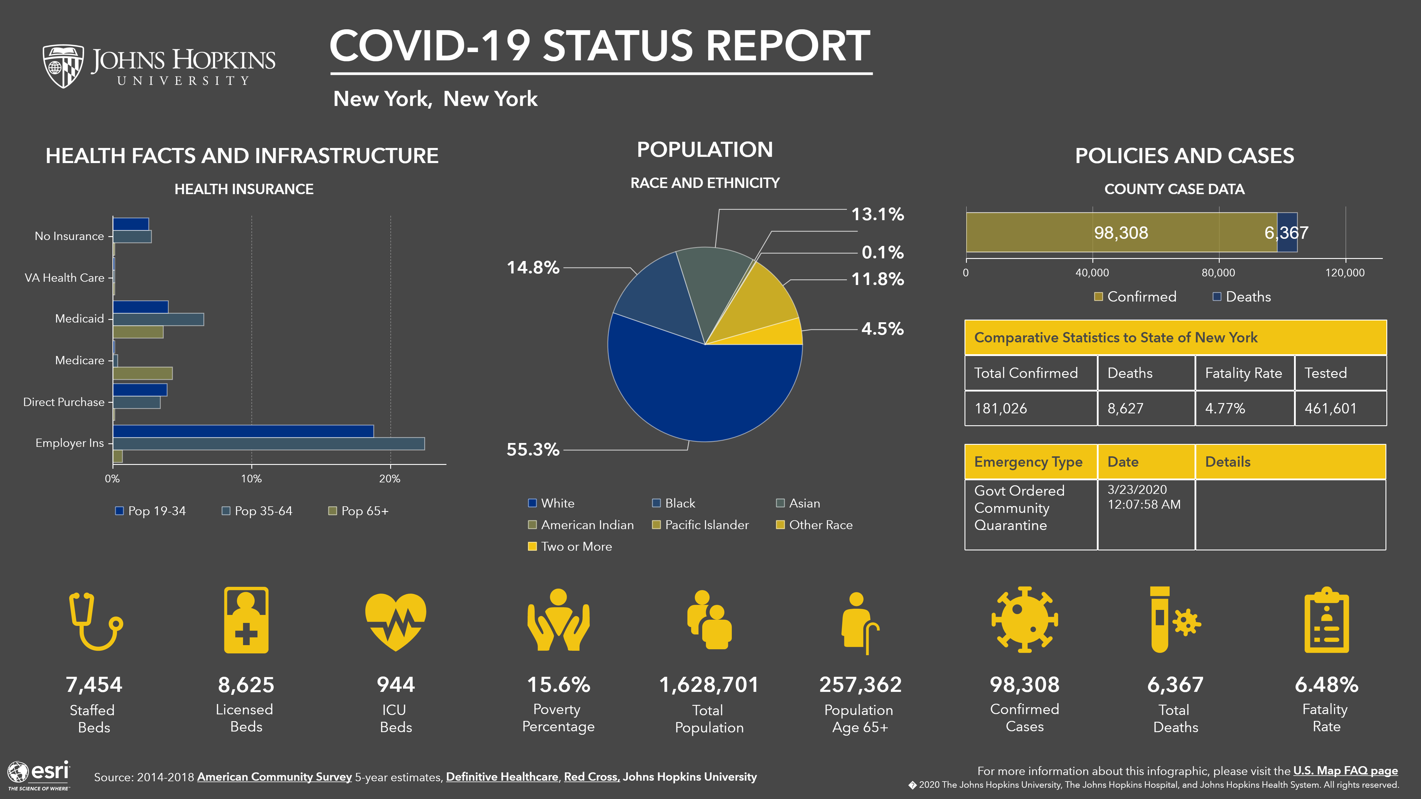
Johns Hopkins Coronavirus Resource Center
The Johns Hopkins interactive map enables users to track total number of cases and deaths by region. The tool also can be used to break out each country into a COVID-19 status report with a list of ICU beds, licensed beds, ventilators, and more. The one above is representative of New York City, but this can be done for any county in America.
TIBCO Software, a vendor that monitors and analyzes large amounts of data, created the COVID-19 Global Status Check to track the growth of the virus in various regions across the country and includes a clustering analysis based on how different countries are responding. TIBCO also uses local county level data to help different regions of the United States find the biggest outbreaks.
Surge Capacity
Penn Medicine COVID-19 Hospital Impact Model for Epidemics (CHIME)
COVID-19 Surge Demand Calculator
Penn Medicine created its CHIME tool to help hospitals forecast their expected number of in-hospital patients, daily admissions, ICU admissions and patients who will require a ventilator. Penn says it uses a Susceptible, Infected, Recovered model, a standard epidemiological modeling technique, to make its projections.
[Related: 6 ways to increase ICU capacity among COVID-19]
Systems Utilization Research For (SURF) Stanford Medicine is an ICU calculator for estimating daily number of ICU beds, acute care beds, and ventilators needed. To use the model, a user inputs estimates of the characteristics of the patient population and hospital capacity.
Sg2, a health analytics company which is owned by Vizient, created a surge capacity calculator as well. This tool models COVID-19 patient surge impact across local populations and gives users the ability to adjust capacity considerations for regional market, health system and individual hospital planning. It offers a customizable hospitalization rate and models different infection rates and the impact of social distancing.
Community Data
Columbia Severe COVID-19 Risk Mapping
Columbia created a mapping tool that visualizes community data with multiple layers. Taking federal data from the Census Bureau, Centers for Medicare and Medicaid Services, and the Health Resources & Services Administration, this tool reveals the numbers of older people and numbers of people with underlying chronic conditions within a certain region; both populations especially vulnerable to COVID-19.
Jvion, a health care analytics company, has released a COVID Community Vulnerability Map—which performs similar tasks as Columbia’s tool. It identifies populations down to the census block level that are at risk for severe outcomes upon contracting a virus such as COVID. It also is overlaid with points of interest, such as hospitals, food sources and transportation, in relation to the at-risk communities and includes top socioeconomic influencers of that area.
Other Data
State Data and Policy Actions to Address Coronavirus
Coronavirus has encouraged cross-state collaboration like never before. To help leaders understand policy actions around the country, Kaiser Family Foundation broke down not just a state by state look at the number of coronavirus cases and deaths, but the actions each state has taken to mitigate the pandemic.
Lastly, Deloitte’s Economic recovery dashboard monitors economic, community and health indicators that will signal when the rebound stage has arrived.